Fidelity Investments UX Design
Savings App
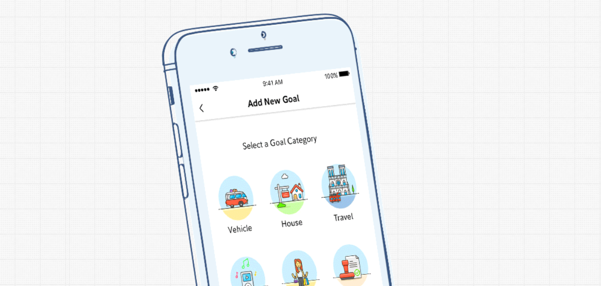

As an User Experience Design Intern at Fidelity Investments I worked with a small team of 6 working on a 10 week long project attempting to create a digital service to help young adults save money.
Using Design Thinking we brought the concept from a simple idea to a full scale working prototype and presented to the entire UX department.
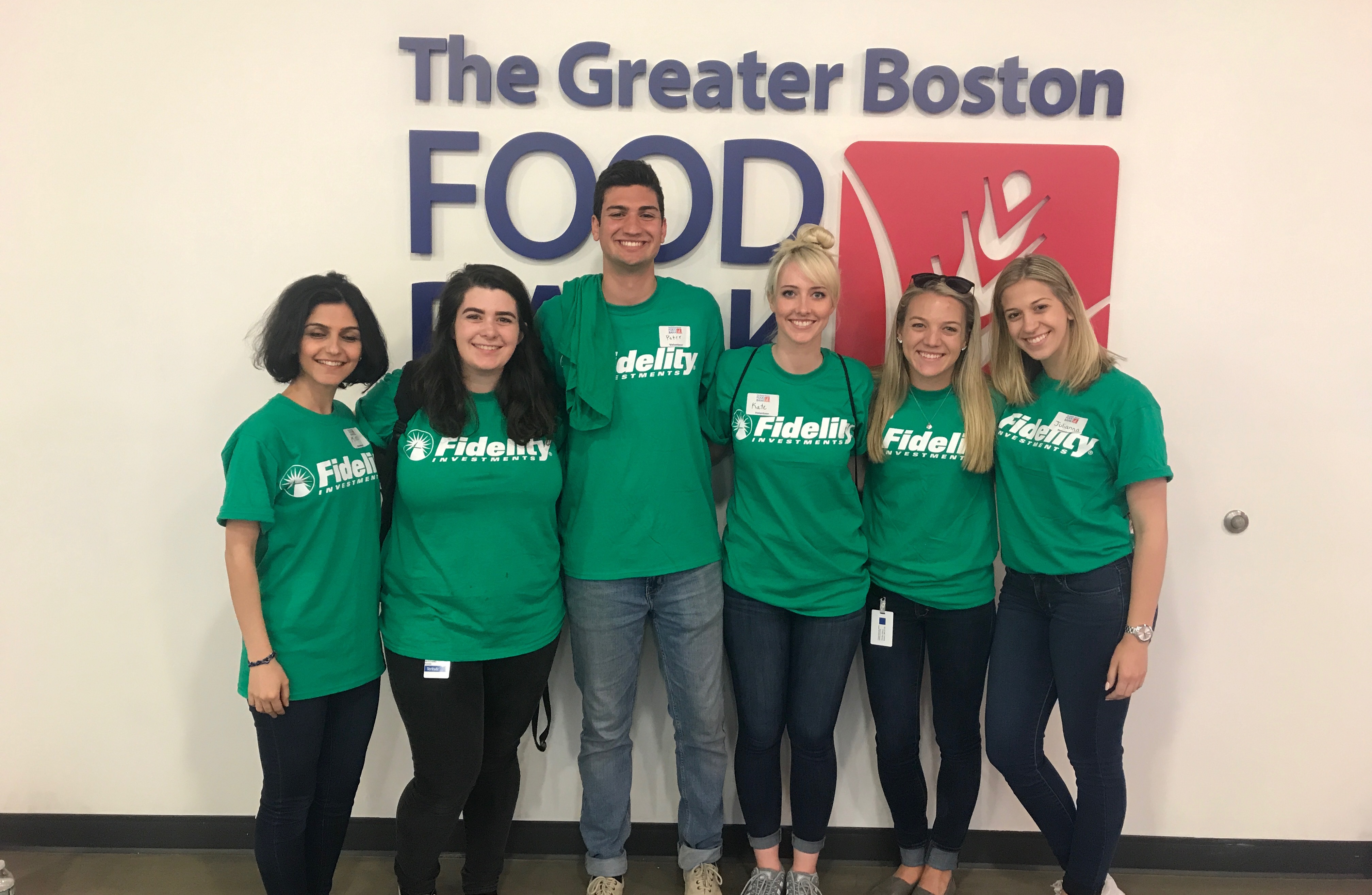
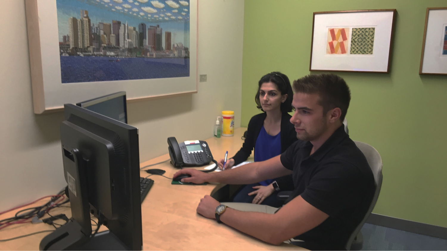
Below are the Fidelity-Interns or Fidterns as we like to say. I'm the tall guy in the middle. Together we researched, designed, tested, refined both our designs and ideas, and then refined some more. Our methodology was as follows:
In a day long session of design thinking we interviewed over 20 millennials, went through 40 packs of sticky notes, prototyped with pipe cleaners toilet paper rolls and silly putty, tested our designs and had a bunch of fun.
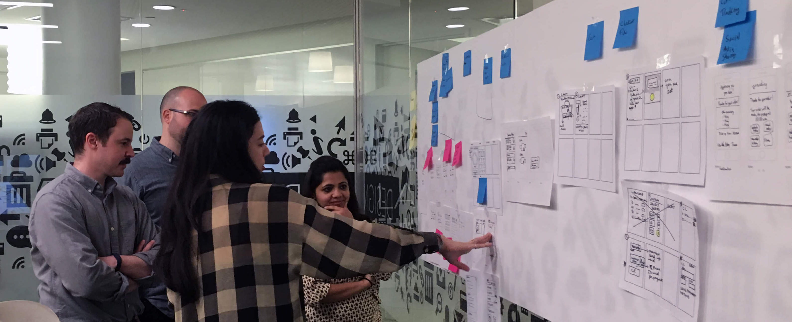
After going through a day of design thinking we had spoken with our target audience and come to the conclusion that not only was saving a problem but one that needed to be addressed.
We approached this problem not from a technology standpoint, but an emotional one. What drives someone, what causes someone to look down the road, and how can you help some be consistent over days months and years.

We created an in depth persona based on all of our interviews. We wanted to target a younger spender, someone who wanted to travel, eat out and needed help to save for life after college. We researched average incomes, surveyed for motivations behind saving and applied these statistics to her.

Apps like Acorn and Digit provide a user with a system in which they hook up their bank account and occasionally money is taken out and put into a savings account. This is great becasue if you don't need to think about saving, it becomes easy.
The problem with this system is it doesn't create positive saving behavior. In order to form habits the user must consistently interact with an idea. In this case the idea of saving for long term goals.
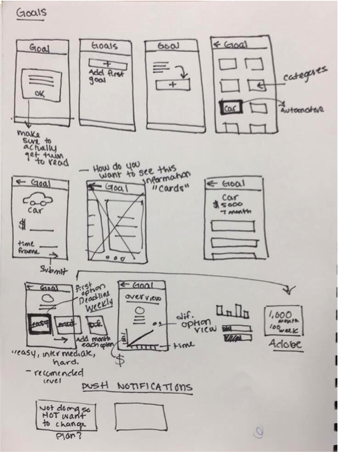
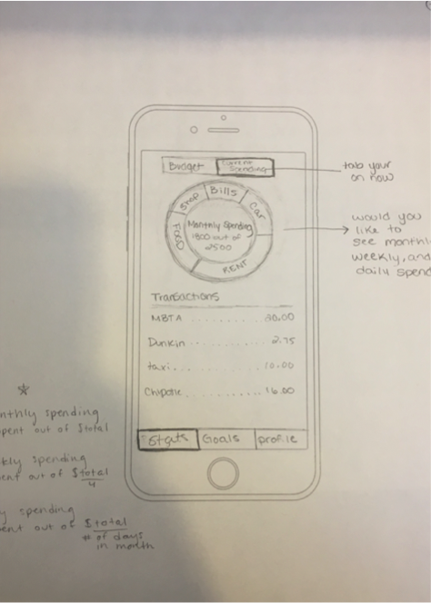
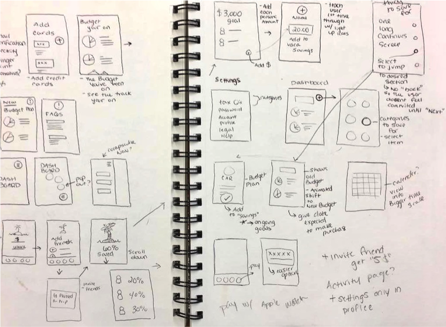
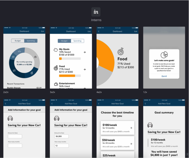
We conducted several usability tests to check where people were getting stuck and what features people found most useful.
We created Cache, an app based on the idea that providing the right amount of interaction to keep someone motivated & engaged while automating the savings process for maximum results.
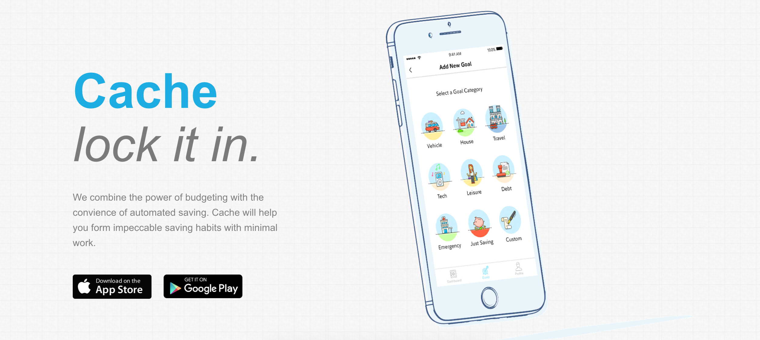
You start by creating a budget, nothing complicated, just link your bank account and Cache will sort through your purchases and categorize your spending.
Then you set a goal. People know they have to save for long term goals, they just aren't good at staying on track. Once you set a goal, Cache tracks your spending and updates you when it sees you spending in areas where you shouldn't.

We created a website to advertise the app. Check out the Full Website.

Here is a full walkthrough of our prototype made in Principle. It covers every aspect of the app from registering to budgeting and setting goals.
Below is one of the ways we suggested to be a potential marketing campaign. We wanted to get people walking by Fidelity's buildings to engage with a touch screen wall. This was just a quick example made in After Effects to explore the idea.

In our final days of our internship we presented our entire process, website, prototype, and everything in between to the entire department. We spent hours rehearsing, setting up cables, fixing the projector's colors and other small things that one only learns by actually presenting.
Overall it was a great summer where I got learn from experiences professionals and bond with our small intern team.