Fidelity Investments
Electronic Funds Transfers

Electronic Funds Transfers (or EFTs) allow people to easily move money from one Fidelity account to another. Many customers trying to transfer money digitally, ended up either mailing in forms (shown below) or calling Fidelity call centers for help.
I was tasked with coming up with designs to help users finish the process without calling Fidelity Support.
Many users would select the wrong options for their situation and the website would prompt them to fill out an incredibly long form (below). What the users didn't know was that they didn't always need to be filling out the form. In many cases it was just a back up if they failed in EFT flow.
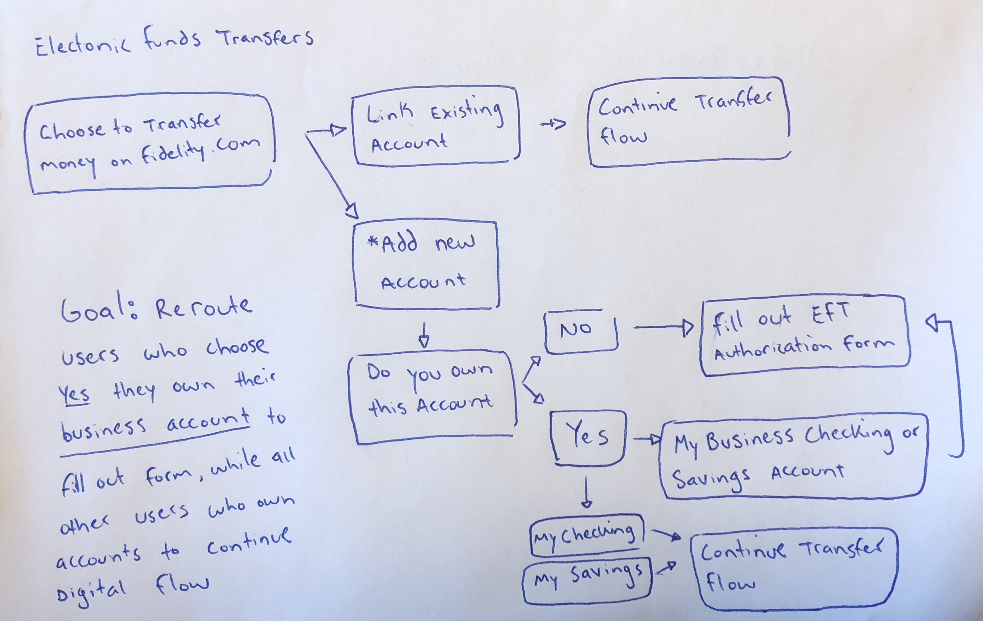
Many users would select the wrong options for their situation and the website would prompt them to fill out an incredibly long form.
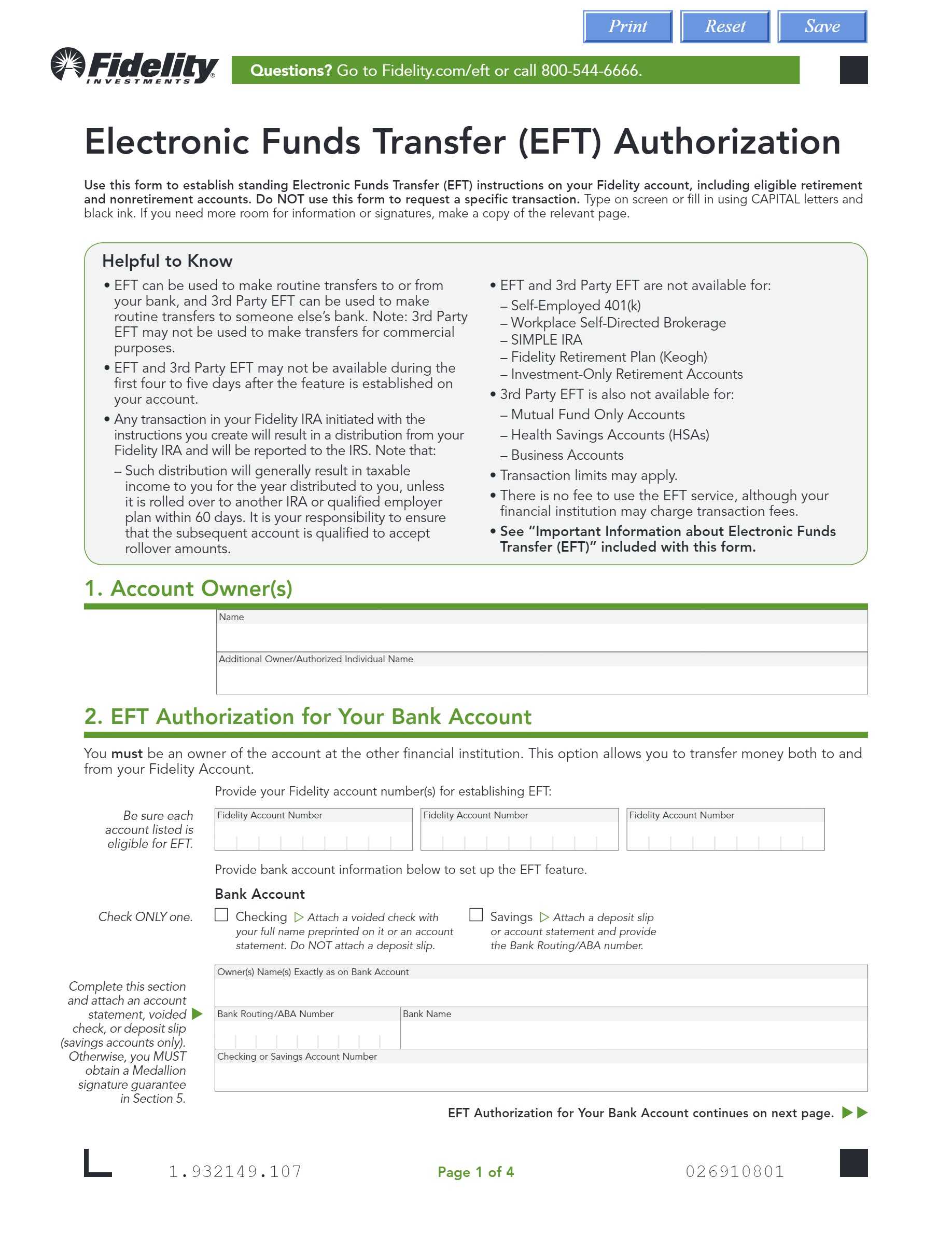
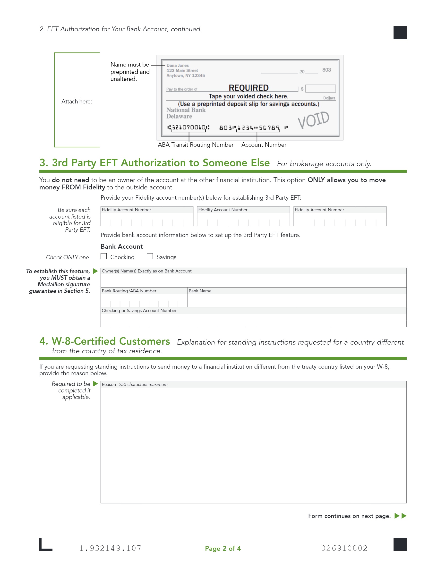
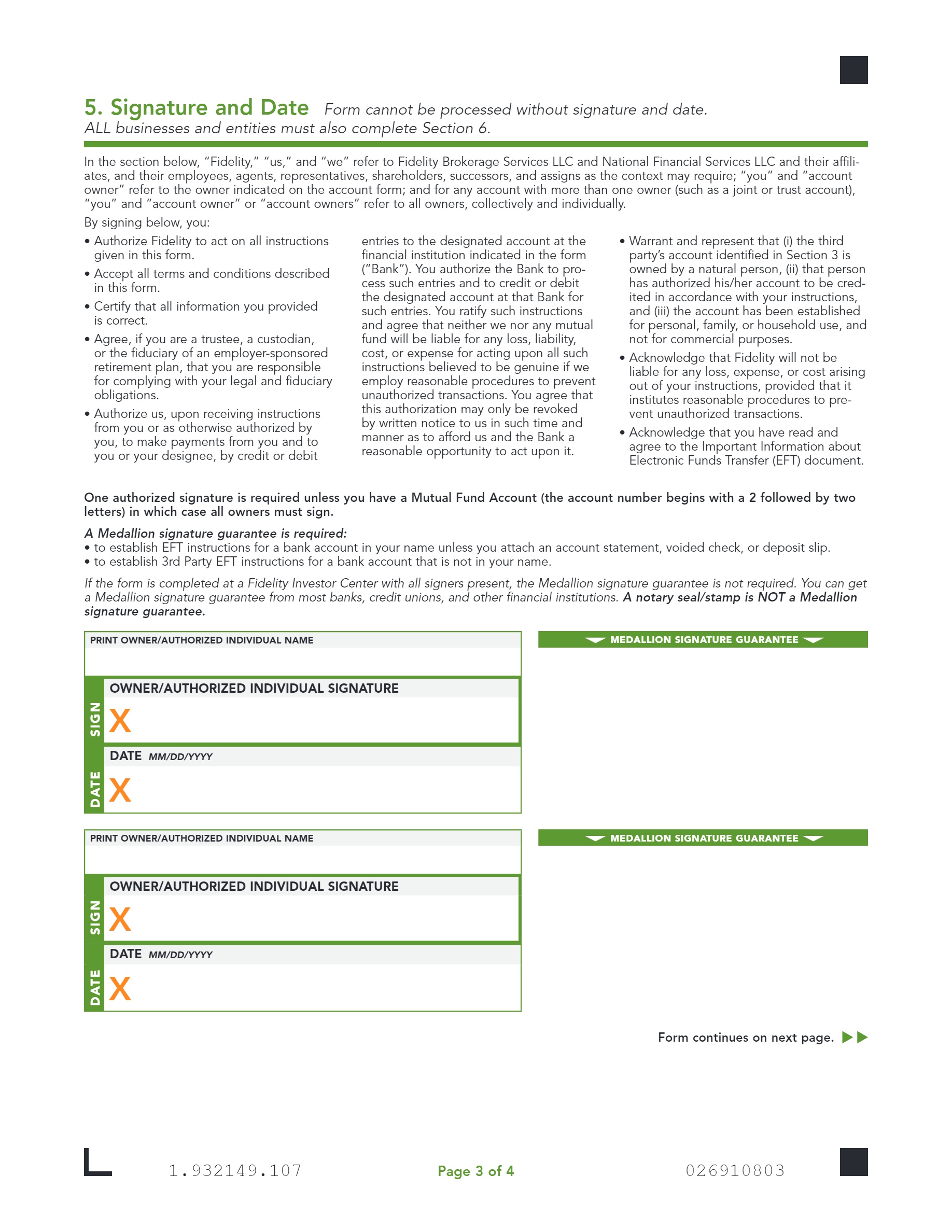
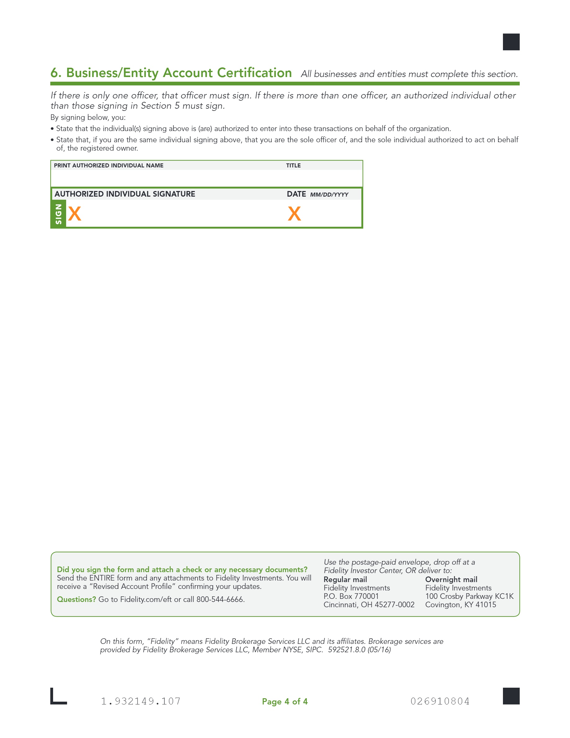
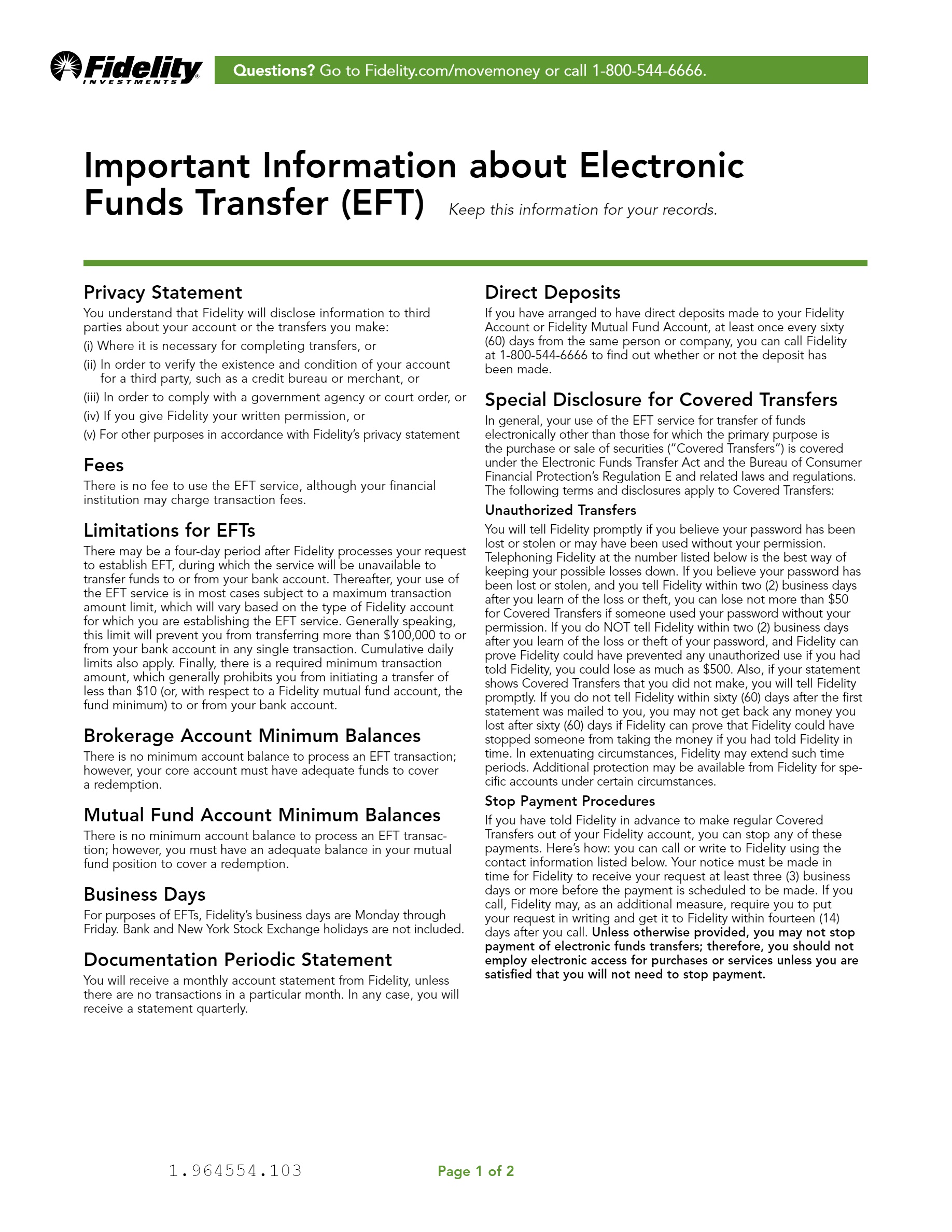
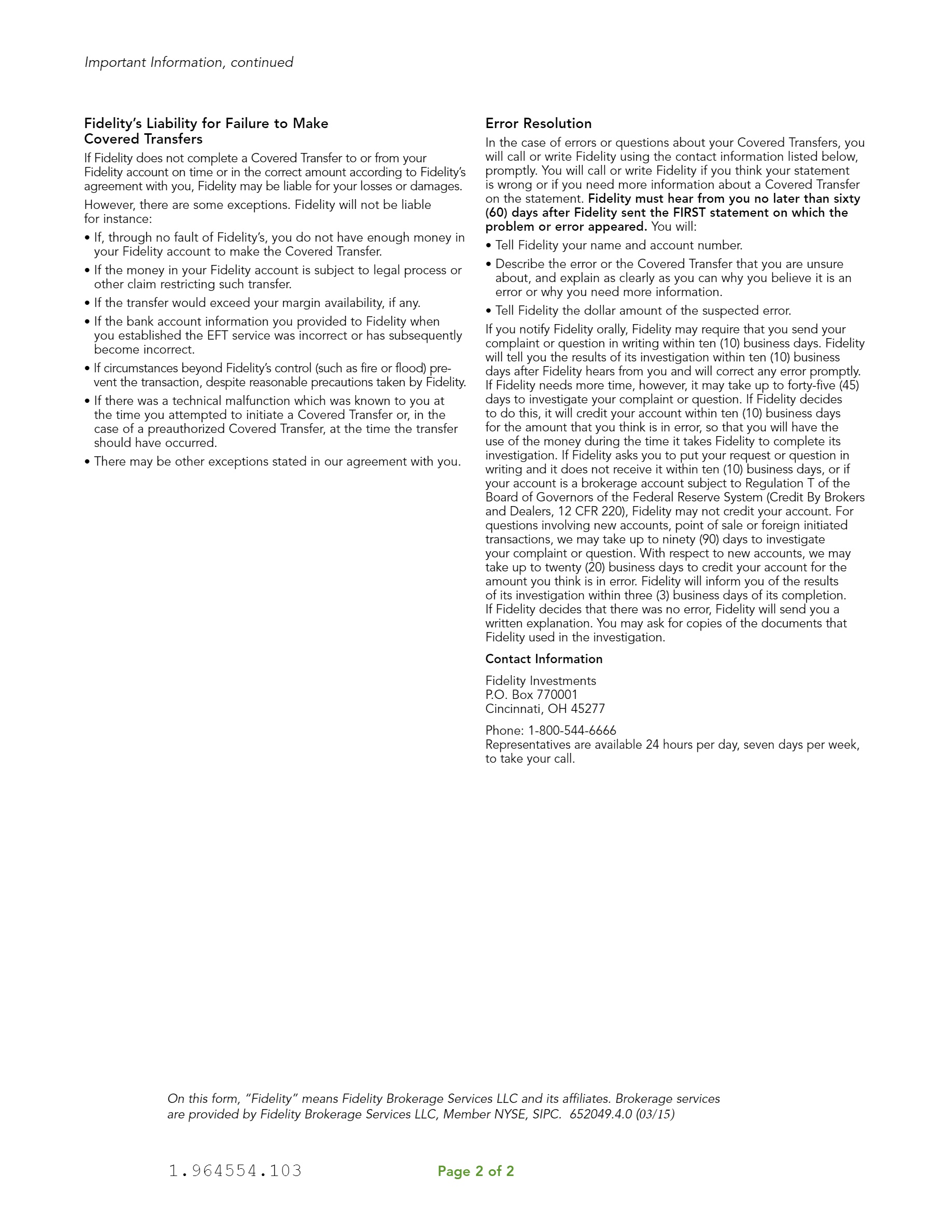
EFT mail-in form
I created six different possibilities for how the screens could potentially look (sorry, I can't show them). The team decided that the best solution was a "Yes" or "No" tab. This allowed the user to pick "Yes" (thinking they own it, when in reality they don't) and then select "My business". This would take them to the same place as clicking "No" in the tab option.
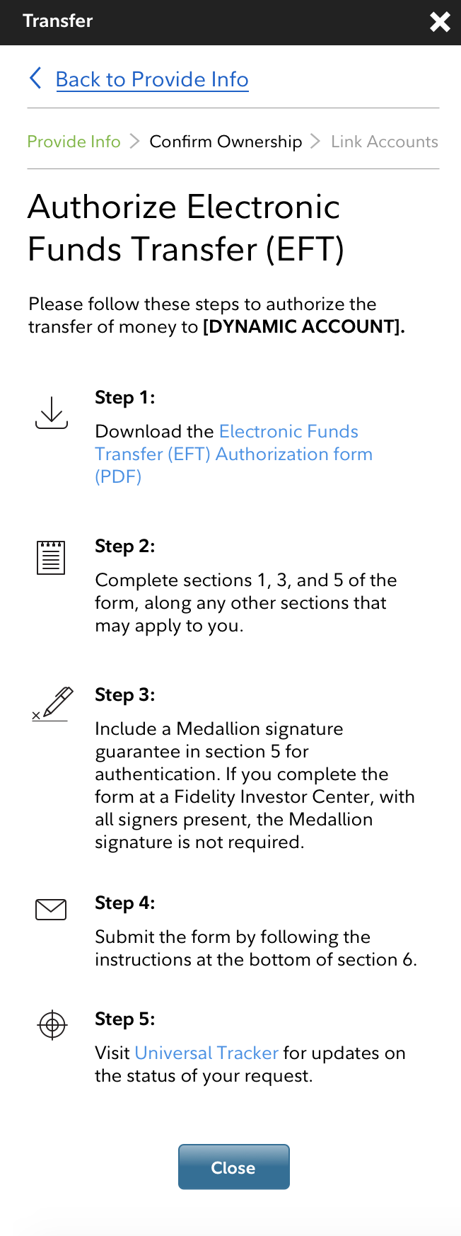
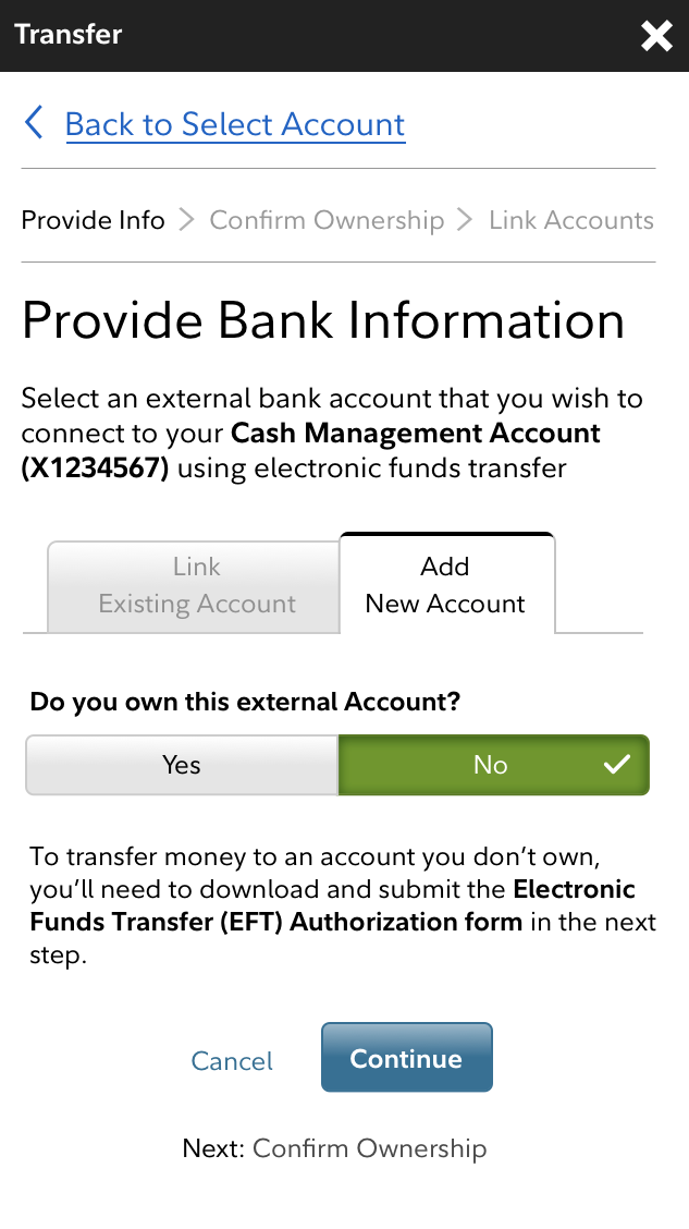
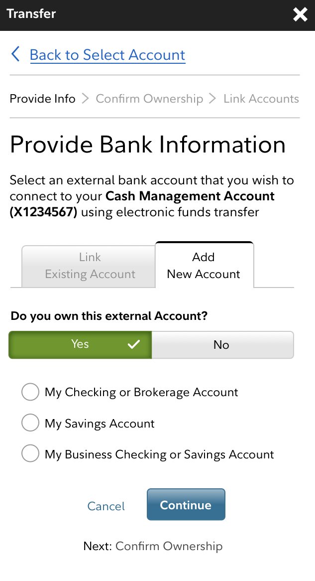
Two weeks after launch we have saw a 20% reduction in "confirm ownership" failures which impacted Fidelity's bottom line directly, potentially saving 225K per year.
This project was completed for ship-it day and was designed, tested, developed, and launched in just one week!
