Web Design & Development
DMCT Website Redesign
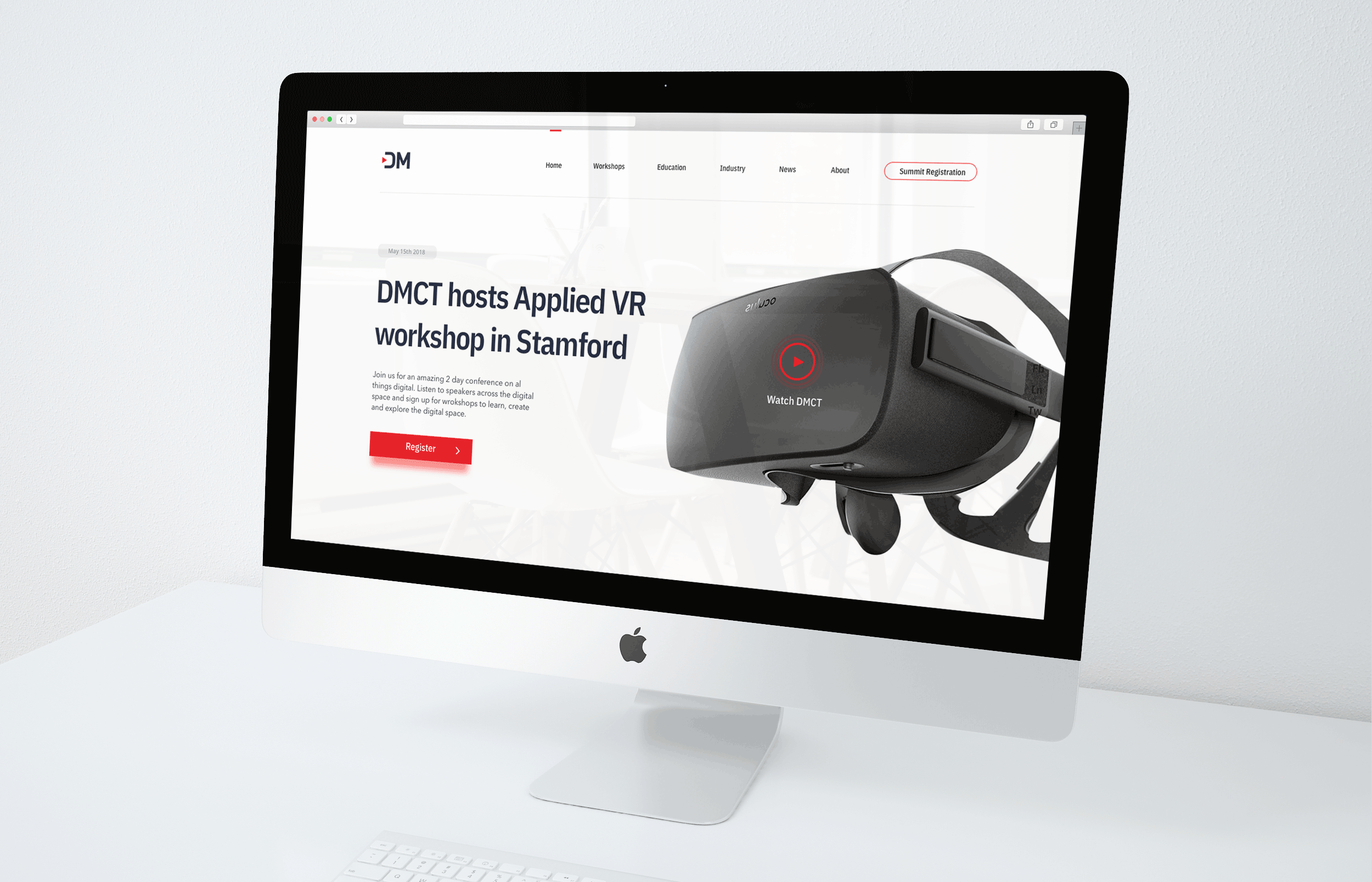

Digtal Media CT is an organization that hosts workshops, educational conferences and premotes digital work in Connecticut.
While all of the functions they hosted were great, their brand image, particularly their website was not the innovative image they wanted to present.
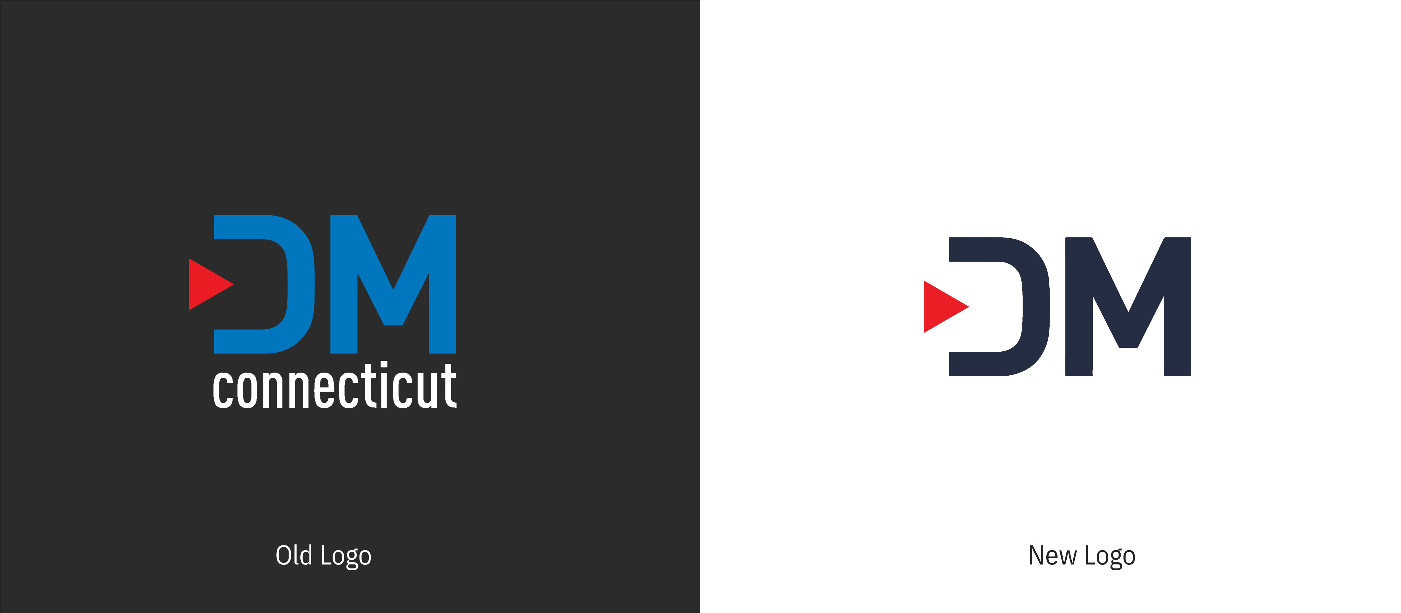
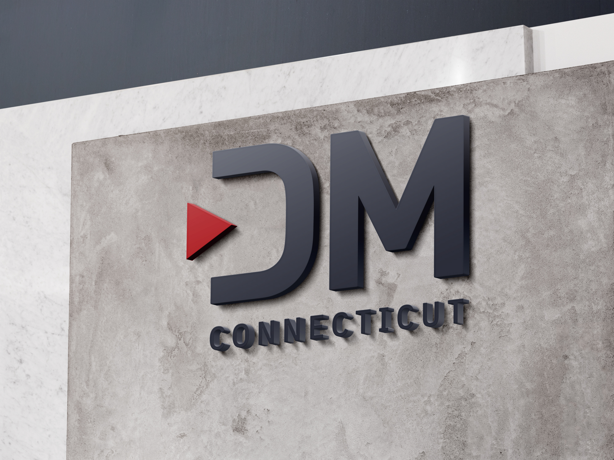
DMCT's original logo isn't bad. However, the bland blue makes it seem outdated and use of the long word connecticut makes it hard to read if the logo is small (like on a website navbar).
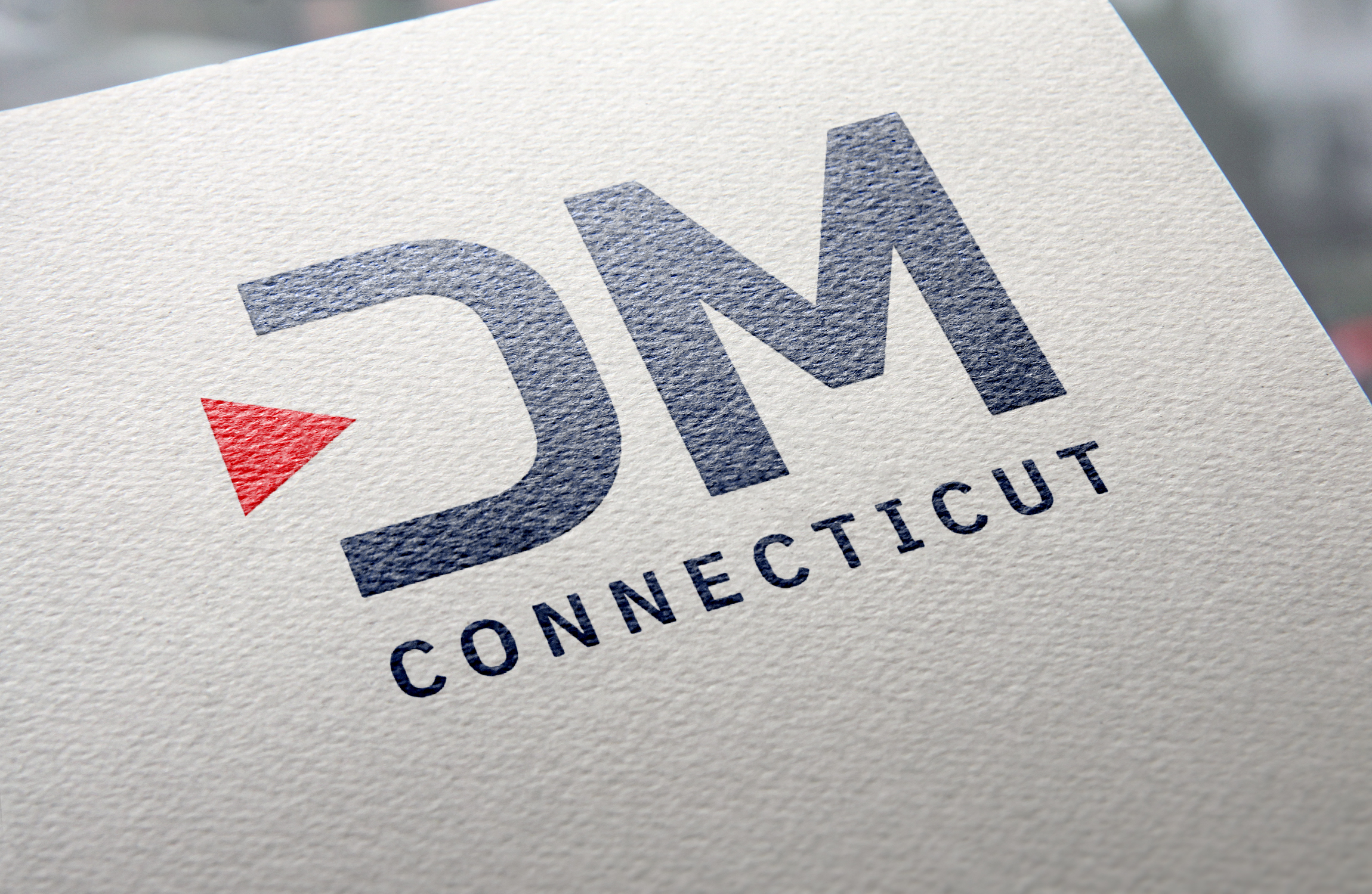
The new logo I made followed the same design but updated the colors to refelct an innovative and digital company and removed the "Connecticut" for small instances like in the nav bar (keeping it for larger branding purposes).
Google's material design has hundreds of awesome open source icons that I used for this project. They come in both SVG and with a github repository so both me and my developers can easily access them.

In order to create a clean and consistant brand style I created a full style guide that I updated and shared with my team as new assets were created.

This is what Digital Media CT had of Feb 2018. Check out the original website.


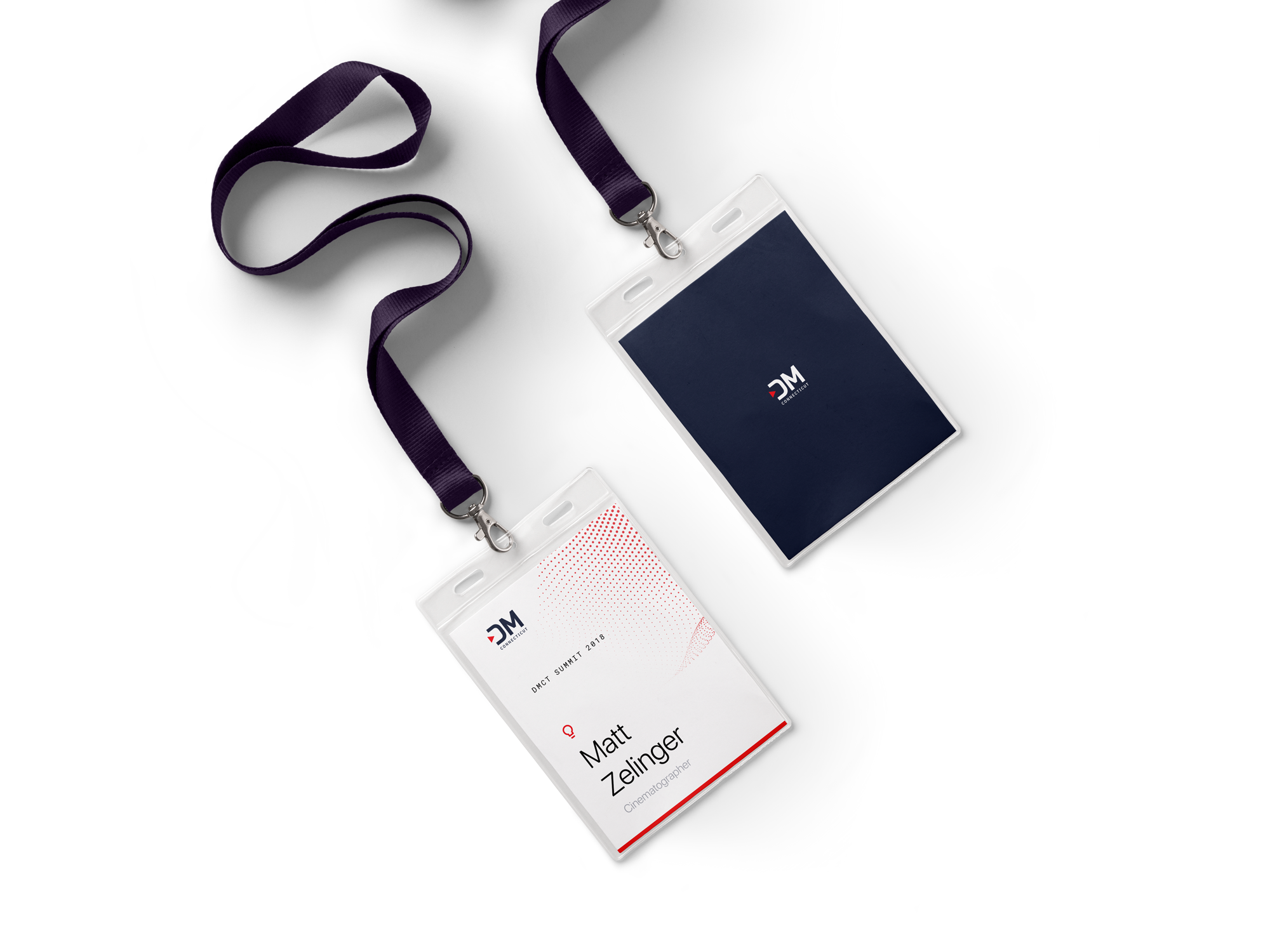
DMCT's 2018 Summit is the kick off for their new brand, new workshops and entry into becoming CT's driving force for innovation in the digital space.

This is page was to encourage students and adults who want to gain exposure and skills in the digital space to sign up for DMCT workshops.

While the baseline design work is done, we are still in the process of bulding out wireframes for more pages, doing research into how people will use the website and looking to expand our reach with more interactive features.
The site should be up and running in the next few weeks so come back soon to see the real deal.