UX Case Study
Card Maker Pro


For this project I was given a company "Card Maker Pro" who specializes in card creation. Their company is made up of writers and designers who make cards for other people who pay to have a card made.
Employees have complained about recent updates to their system and I have been asked to assess and redesign their digital workspace.
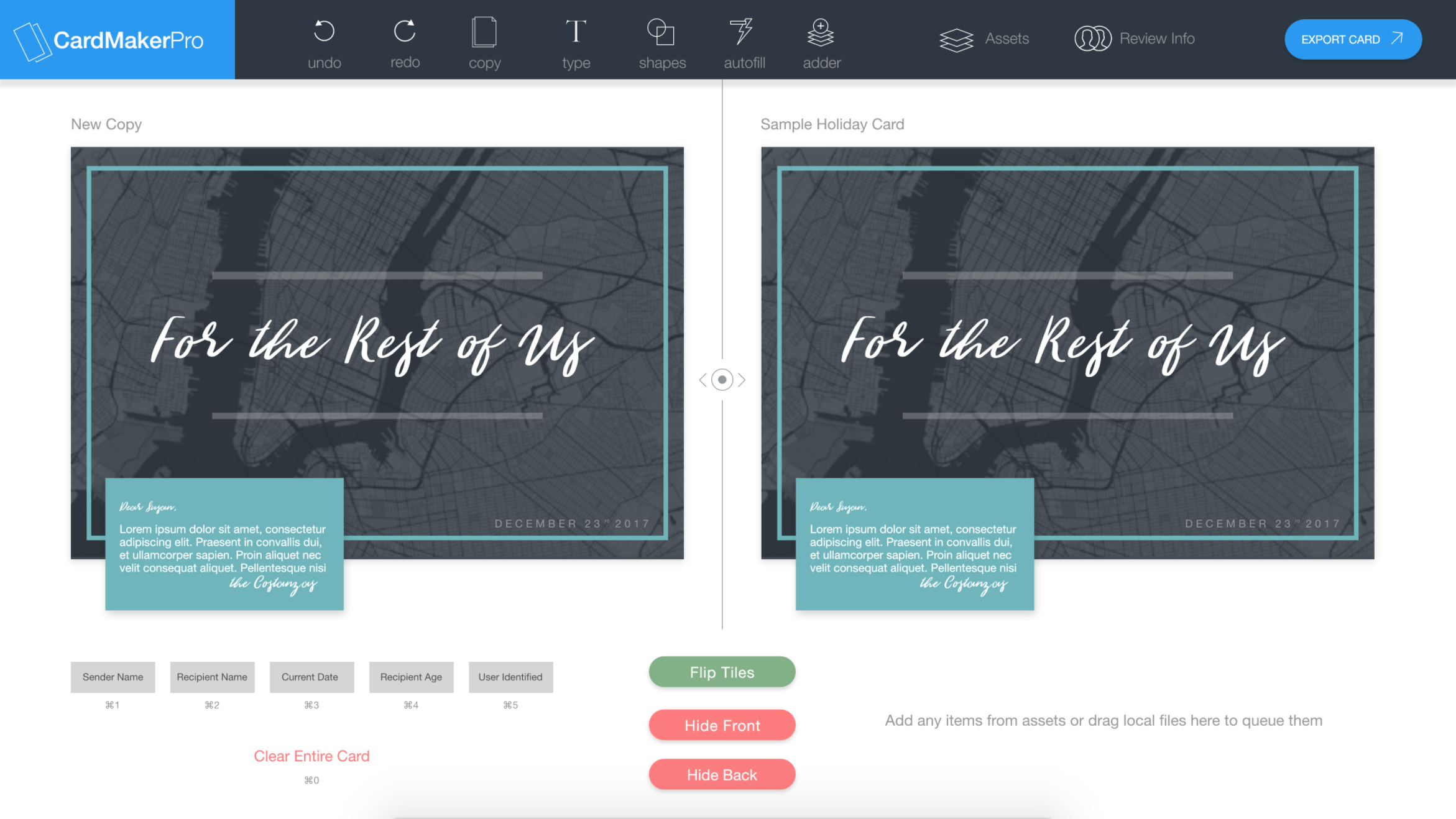
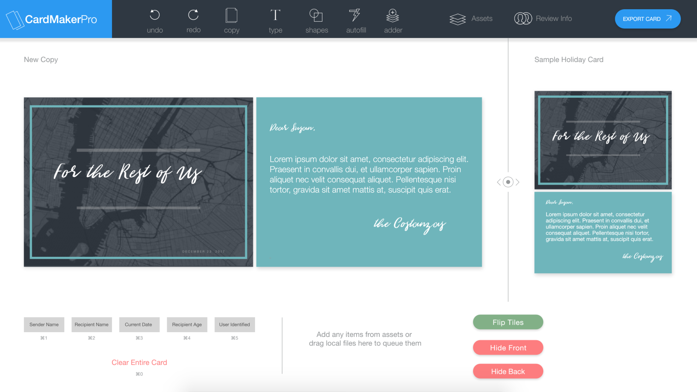
The digital program they have been using until recently is as follows: Two sides, the right with a card that has been previously made to reference and the left with a new card. Designers would use the old card to copy text from and customize for the current recipient.
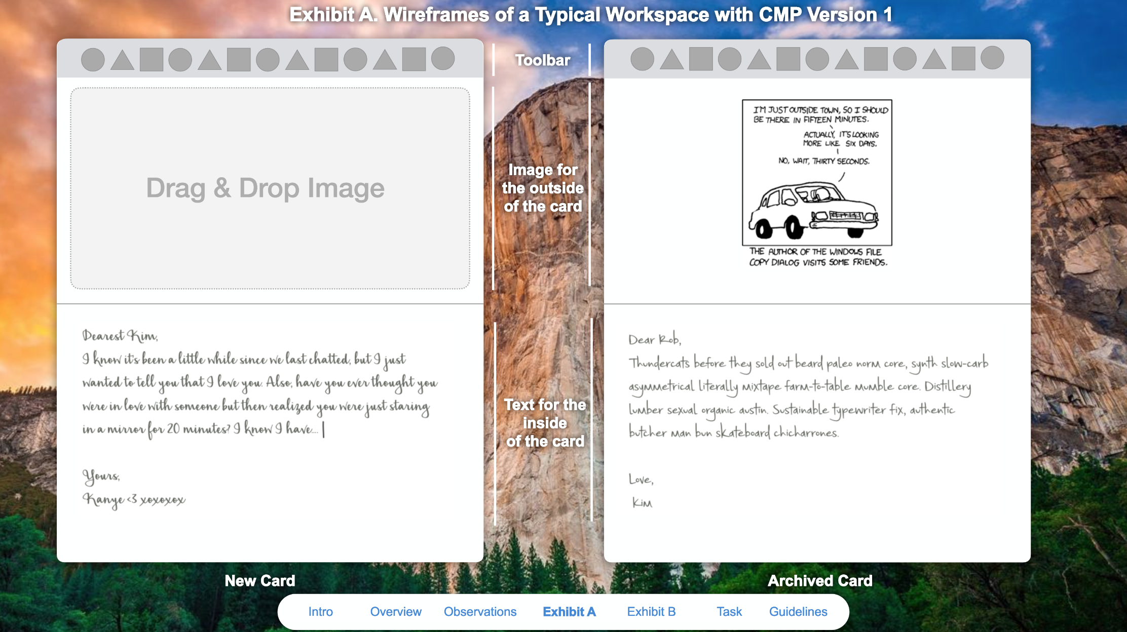
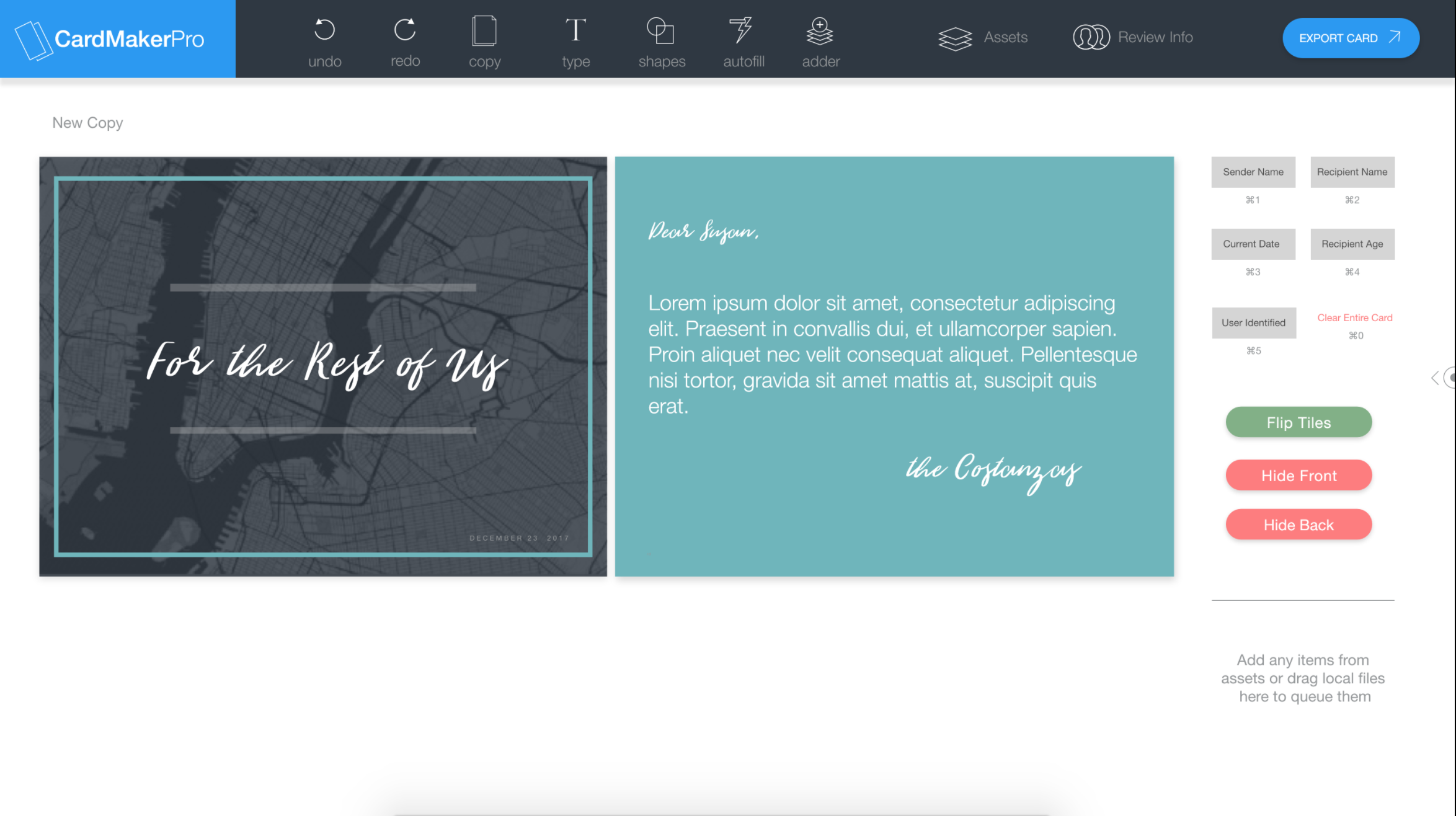
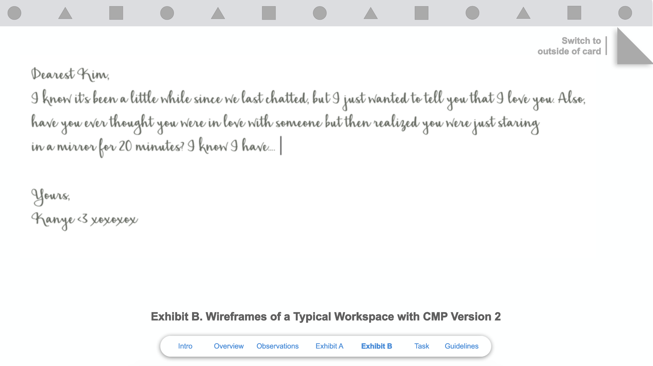
The new version, CMP Version 2 which was updated recently has a new layout. It is now only the new card and full screen. In order to switch to the front you must flip it in the top right corner. It turned out employees hated this new version, despite the larger workspace, and wanted another update.
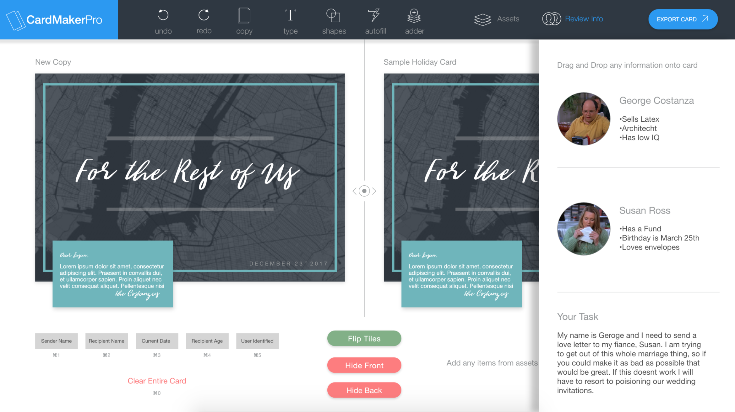
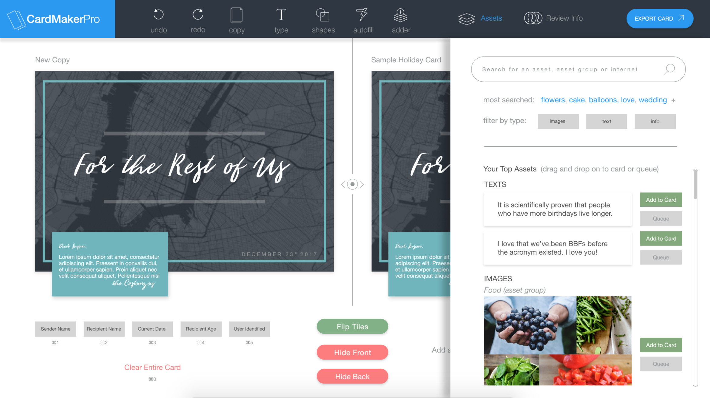
The two things that employees said they used CMP Version 1 for was to look at previously made cards for inspiration and to copy and paste from.
My sketches outlines a design would incorporate both of these requirements as well as the advantages of a full screen format. In order to do this, I thought having a dynamic layout like After Effects would be a great solution.
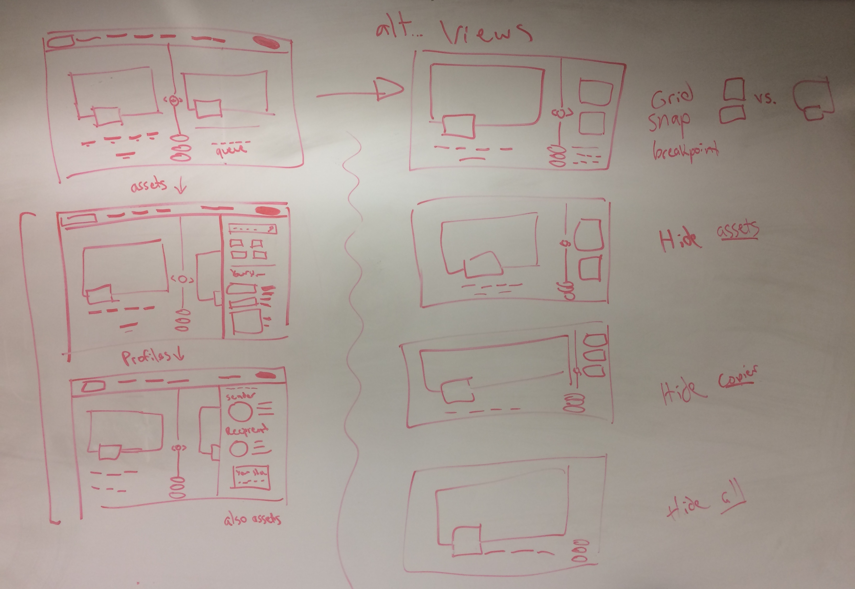
When the designer is first using the system there should be equal importance set on both the old card, to draw inspiration from, and the new card.
As the process continues the old card should have less importance and the new card should be able to be focused on more. I created a dynamic layout that the user can pull back and forth changing the ratio of the left to right.
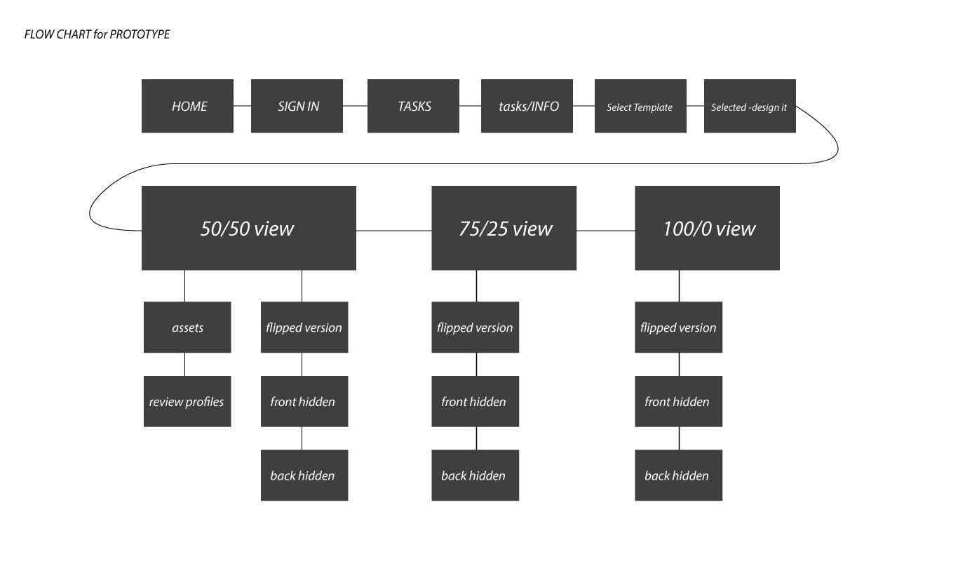
This low fidelity prototype was a good way to show how the layout would change based on the importance of what stage the designer was in.
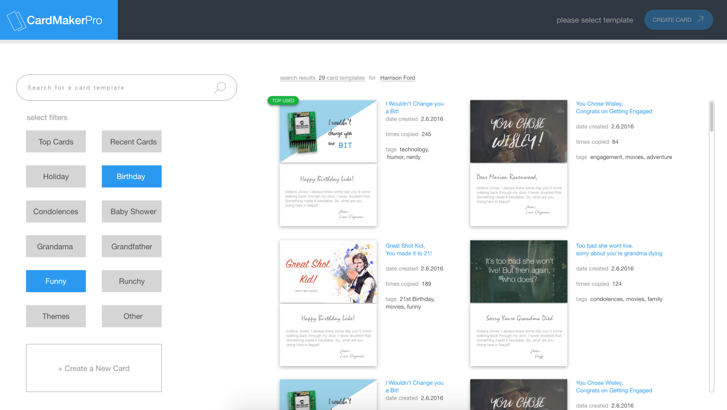
I created a functional protoype with Adobe XD to show the process from start to finish. Check it out here.
