Scenario I was given: You've been hired by some hipster-ass sandwich shop to design the tablet app their customers will use to order at the counter. This is for walk-in customers only, NOT for online ordering.
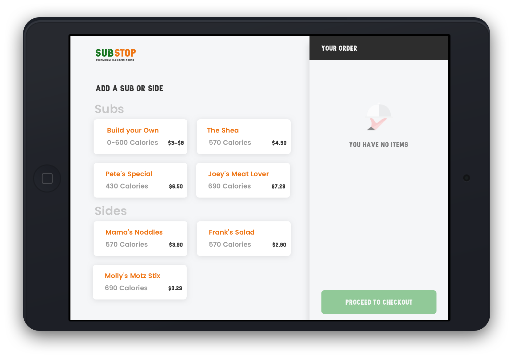
Here’s an annoying caveat: the client has requested that this be designed in such a way that the user doesn’t have to scroll up and down.
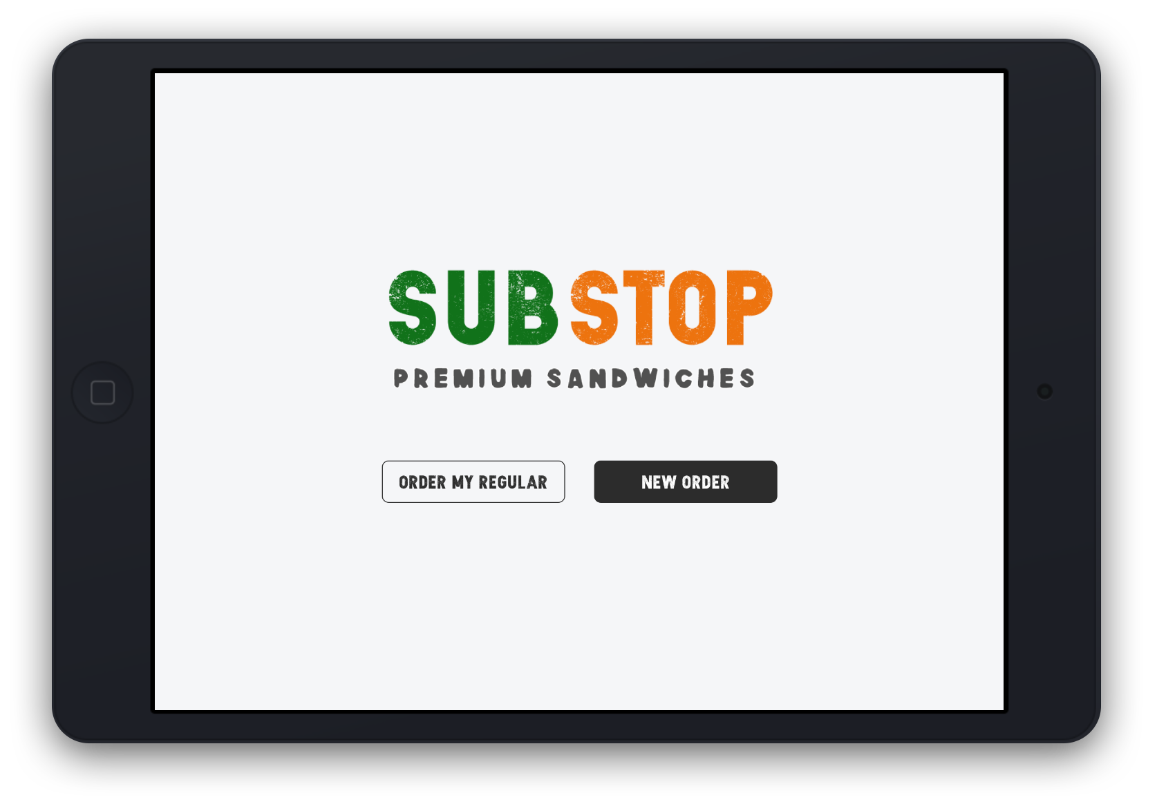
Returning users should have the option to get their regualr order, while new users should be able to put in a new order.
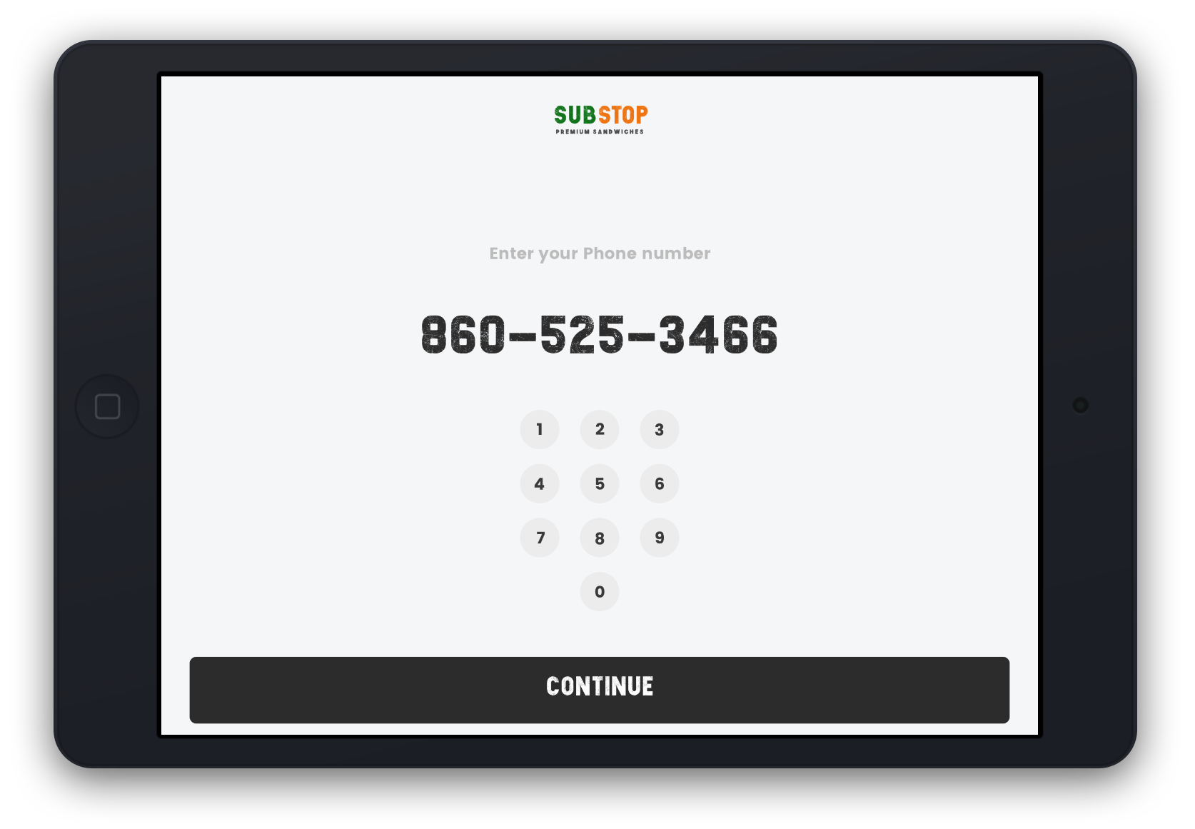
If a returing customer is registered in the system, all they have to do is plug in their number and their usual orders are there!


Keeping each screen simple will keep users moving along quickly, only making small descisons about menu items at a time. Keeping the line moving is a huge necessity in a SubStop.

For this project I made a prototype using Sketch & InVision. Check out the full prototype.